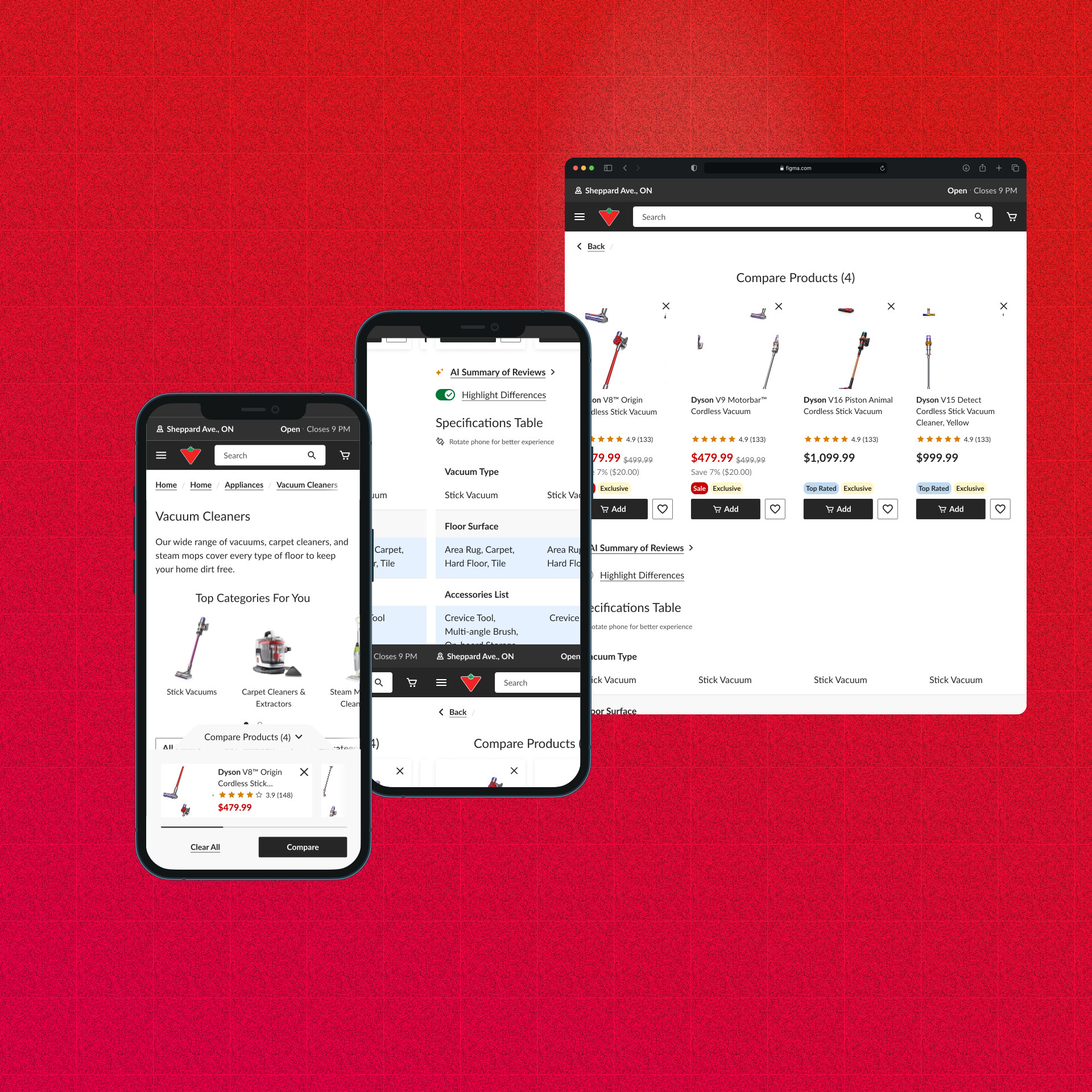
Building Canadian Tire’s product comparison tool for mobile web & app
Duration: September 2025 - Jan 2026
Role: UX/UI designer
Deliverables: High fidelity screens for web + iOS + Android, prototyping, research
Tools: Figma, UserTesting, Figma Make
Brief
Note: Due to confidentiality reasons, this is only a snapshot of the project. For more details, please schedule an interview.
Canadian Tire is one of Canada’s largest retailers. As part of their Digital Value Activation team, I was tasked with designing the mobile experience for the comparison tool on the product listing page for mobile web and app.
State of product comparison tool
01. Only existed on desktop web
Stakeholders had been wanting a mobile web version as well as app version, but a design had not been approved on. The tool only existed on desktop web, and the mobile experience was not optimized for mobile web or app. The client wanted to expand the tool to mobile web and app to increase usage and drive more sales.
02. Small screen size challenge
Mobile screens are incredibly small; how would we fit so much information onto a screen while maintaining usability and a pleasant experience?
03. Maintaining web-app parity
Web-app parity: how do we maintain a similar experience on app to maintain web-app parity, while adhering to iOS and Android guidelines?
How might we implement a mobile comparison tool experience so users on mobile and app can have the same experience as desktop?
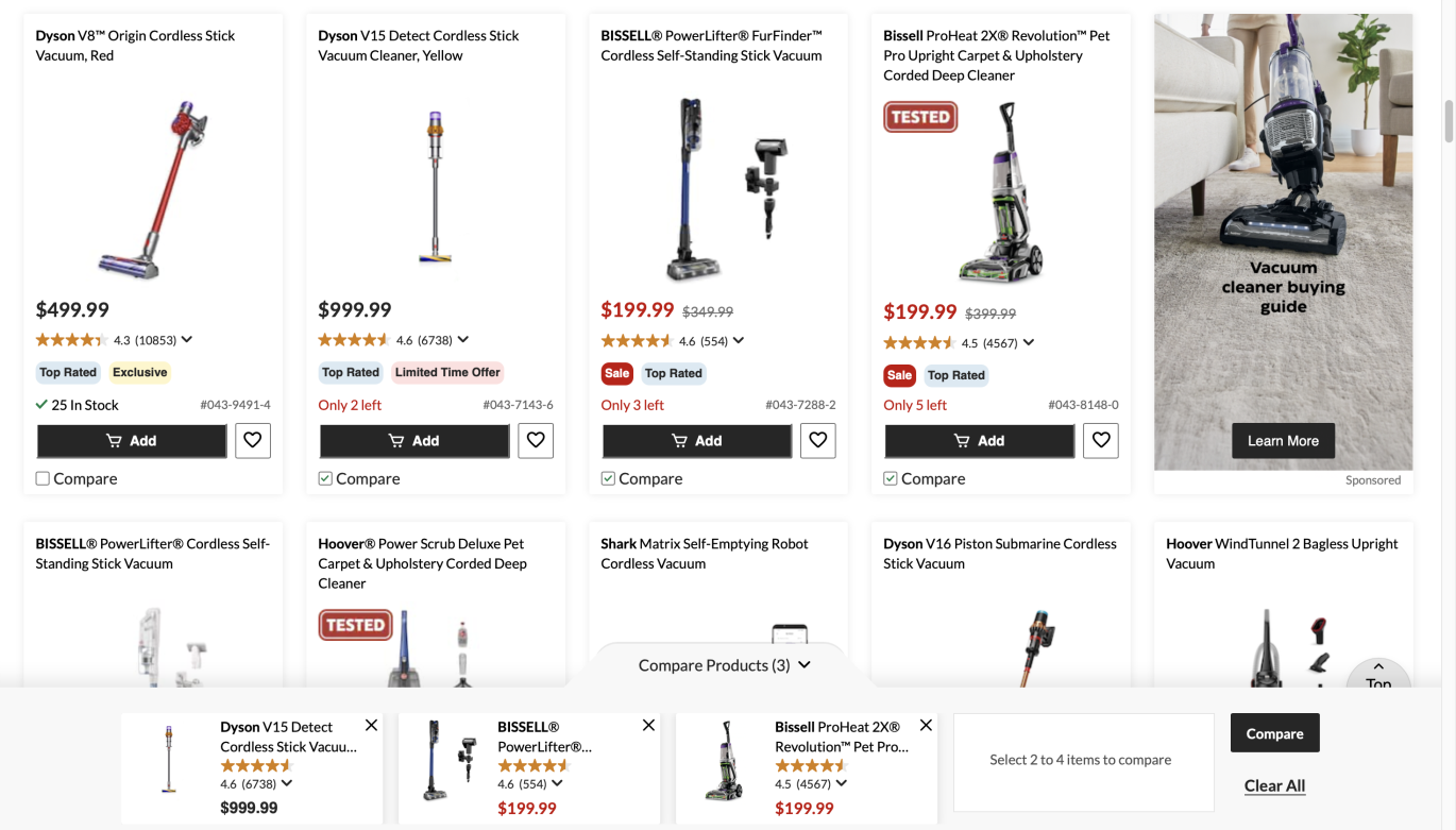
Features Summary
Below are the major updates we made to the product comparison tool for mobile and app:
01. AI Summary of Reviews
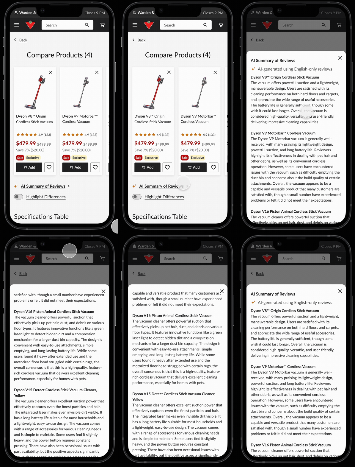
Challenge: The original design would open up the comparison table on a layover for desktop, but inserting an AI summary of reviews would require another overlay. How would we fit both the comparison table and the AI summary of reviews on a mobile screen without overwhelming users with information?
To avoid the issue of an overly on an overlay, we made the decision to move the comparison table onto its own page instead of an overlay → 1. increase space 2. avoid usability issues with a table on an overlay
02. Highlight Differences Toggle
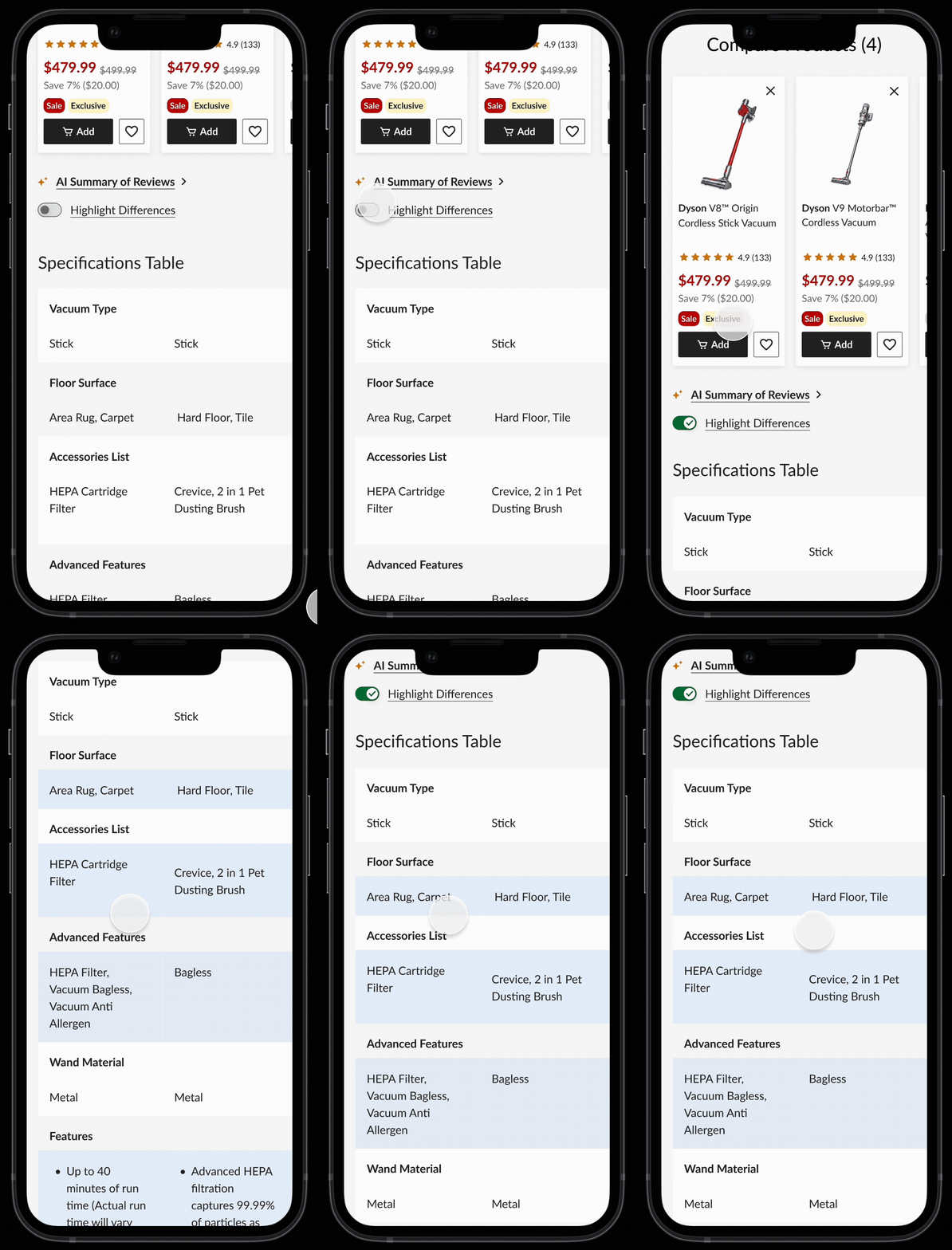
Challenge: Original design would remove the tabs that were similar. From our research, users felt that this took away important information,
Solution: We came up with the solution of “highlight differences”. This toggle would highlight a row if there was 1 product that had a different specification than the others:
03. Sticky row headers
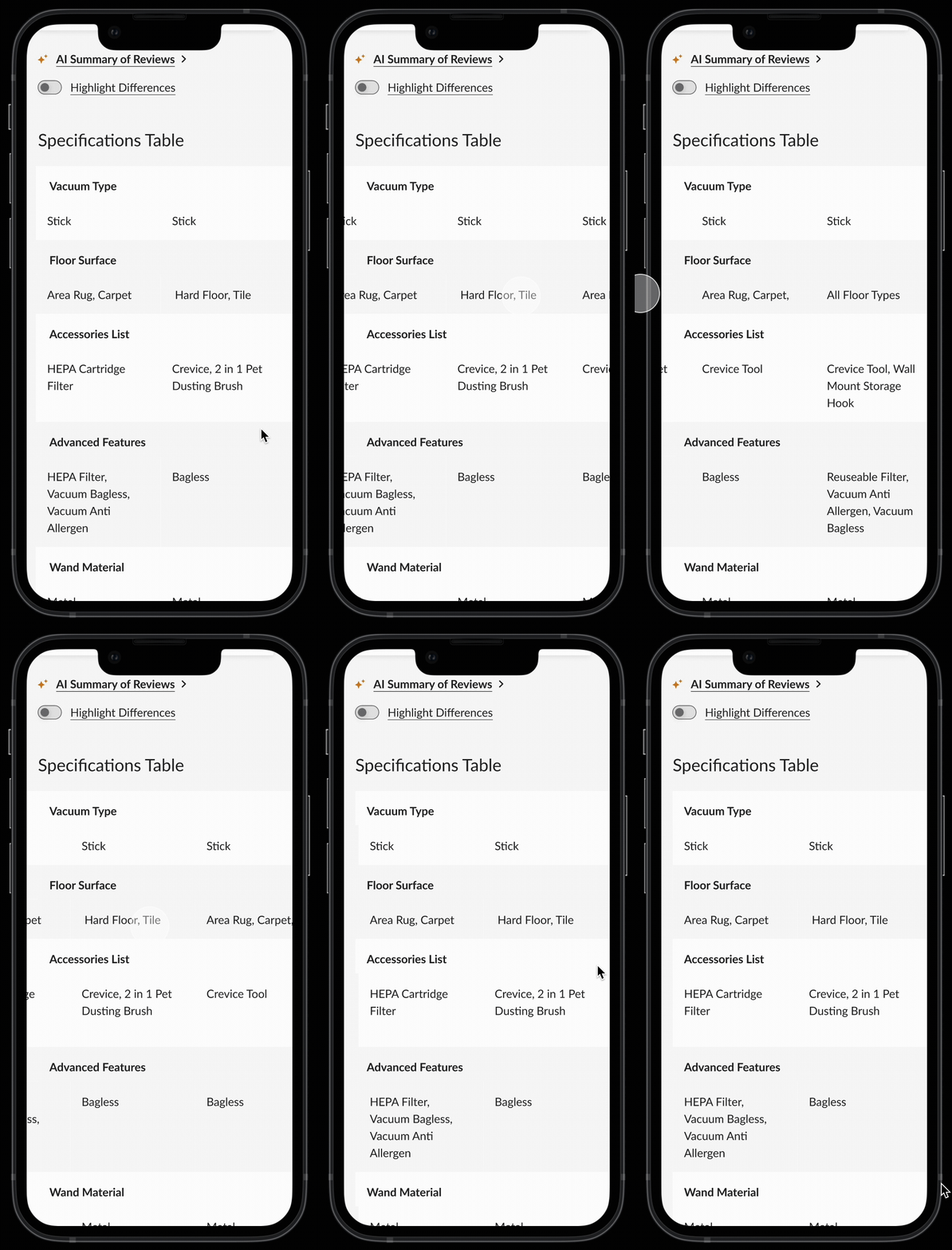
Challenge: How best to consolidate all this dense information for 4 products into a 375px screen?
Solution: Keep tab headers fixed, but allow the columns to be scrollable.
04. Collapsible product tiles
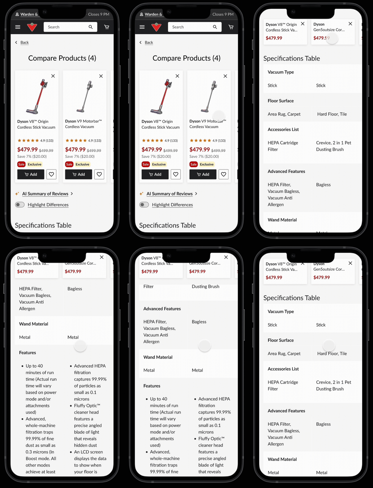
Challenge: Space - how do we display product cards while a user scrolls information on the table while saving space?
Solution: Trimming product card information once the user scrolls down & when the product card is 80% out of viewport. Taking feedback from our PM, we selected details from the product card that could be removed and only kept essential information like price and product name.Removed elements such as “clear all” and also redacted it from desktop versions.
User Testing
01. Objective
The goal of the study is to understand participant perception, expectations and experience of the comparison tool, to uncover any pain points or friction
02. Methodology
Unmoderated customer interviews
03. Participants
- — 6 participants
- — Age: 33- 61
- — Canadian
- — Frequent CT shoppers (3) and general online shoppers (3)
Results
- — All participants found the flow from the PLP to the comparison table intuitive & found the table easy to navigate.
- — All participants understood how to highlight differences and many organically pursued that feature when they first saw the table.
- — Most participants responded favourably towards the AI summary of reviews
- — Almost all participants preferred the landscape view of the table and wanted a prompt letting them know this option is available.
Reflections
After testing results came back, we polished off the file for UI handoff, and in the following months from January to February worked with developers to hanker out any issues that cropped up. The project was successfully delivered and is now live. App development is in progress and is slated for Q2 2026.